How to create a Color Picker plugin for Strapi CMS
October 31, 2020
I have been using Sanity's headless CMS extensively for the past few months and now feel fairly comfortable with its features and advanced customization options. Reason why I decided to spend some time exploring alternative platforms in the JAMStack world and recently spent a few days experimenting with Strapi.
Strapi is developed by a (mostly) French team offering another very easy way to deploy a full-featured API for your front-end application.
It is based on Node.js & React.js, can be self-hosted or deployed to the cloud (Digital Ocean, Heroku etc) and uses both a REST and a graphQL API for your requests.
One specificity I noticed, compared to Sanity, is the rich GUI it offers, giving you direct access to content management, schema building, roles & users permissions. All these can of course also be modified directly through coding.
I usually look for two things in a headless CMS:
- • the easiness of use, both for me as a developer and for my client, who often is a non-technical user.
- • the potential for advanced customization, like adding custom input fields specific to the client's business use case.
Strapi offers both and tweaking can be done through a plugin system we will now explore.
Plugins
Plugins can be seen as a way to enhance your application and, if my understanding is correct, are themselves key components of Strapi as their whole schema builder (Content-Type Builder) and Media Library are indeed plugins.
Talking about schema, creating new models for your content is extremely easy as Strapi provides a list of types directly available covering most of your needs.
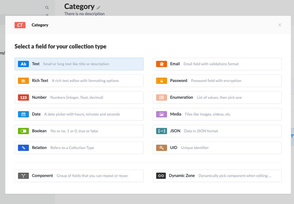
However it is, as mentioned, fairly common to need custom types and I decided to try to build my own: a color picker.
Strapi's documentation is a good place to start, as it covers a lot of topics, from quick start to deployment. I quickly noticed the community was also very active with a lot of content available on Youtube.
This section of the docs gives a basic understanding of the direction to take.
1) Generate a new plugin via the cli
1yarn run strapi generate:plugin colorpickerThis will create a general plugin folder at the source of your project, containing a folder for your new color picker plugin. You'll notice this folder contains itself a bunch of files and even a package.json, acting in a way as an isolated program within your app.
This would, for example, enable you to create custom routes & responses for your API if needed.
In our case, we simply want to display an input component, so no need for routes.
2) Build your components
The next step is to build the component itself.
React Color is a neat little package giving you customizable color pickers out of the box, let's add it via
1yarn add react-colorNow let's build and style the JSX with styled components
1// ./plugins/colorpicker/admin/src/components/colorPicker/index.js
2
3import React, { useState, useEffect } from 'react';
4import { ChromePicker } from 'react-color';
5import styled from 'styled-components';
6
7const Title = styled.h5`
8  margin-bottom: 1rem;
9  color: #333740;
10`;
11
12const ColorWindow = styled.div`
13  background-color: ${(props) => props.color};
14  width: 4rem;
15  height: 4rem;
16  border-radius: 50%;
17  border: ${(props) => props.color === '#FFFFFF' && '1px solid #5B5F65'};
18`;
19
20const PopOver = styled.div`
21  position: absolute;
22  z-index: 2;
23  top: 70px;
24`;
25const Cover = styled.div`
26  position: fixed;
27  top: 0px;
28  right: 0px;
29  bottom: 0px;
30  left: 0px;
31`;
32
33const ColorPicker = () => {
34  const [showPicker, setShowPicker] = useState(false);
35  const [color, setColor] = useState('#FFFFFF');
36
37  /**
38   * Handle color change from the the color picker
39   * @param {string} color - in hex format
40   */
41  const handleChangeComplete = (color) => {
42    setColor(color.hex);
43  };
44
45  return (
46    <div>
47      <Title>Color Tag</Title>
48      <ColorWindow color={color} onClick={() => setShowPicker(true)} />
49      {showPicker ? (
50        <PopOver>
51          <Cover onClick={() => setShowPicker(false)} />
52          <ChromePicker color={color} onChange={handleChangeComplete} />
53        </PopOver>
54      ) : null}
55    </div>
56  );
57};
58
59export default ColorPicker;
60
Nothing fancy here, we simply create a nice color window acting as our button to open the color picker. The default color is defined by the color state.
Clicking on it opens the color picker. The onChange props on the picker allows you to slide your cursor on the palette and see the actual color appear in the color window. Clicking anywhere outside of the picker closes it and locks its value, registered in the color state.
3) Expose the plugin to your application
Now that we have a functional picker, we need to be able to use it within our CMS. And this is where it got tricky!
The doc mentions registering the plugin and the new field via the admin index
1// ./plugins/colorpicker/admin/src/index.js
2
3import pluginPkg from '../../package.json';
4import ColorPicker from './components/colorPicker/index';
5import pluginId from './pluginId';
6
7export default (strapi) => {
8  // const pluginDescription = pluginPkg.strapi.description || pluginPkg.description;
9  const pluginDescription = 'A color picker for Strapi';
10
11  const plugin = {
12    blockerComponent: null,
13    blockerComponentProps: {},
14    description: pluginDescription,
15    icon: pluginPkg.strapi.icon,
16    id: pluginId,
17    initializer: () => null,
18    injectedComponents: [],
19    isReady: true,
20    leftMenuLinks: [],
21    leftMenuSections: [],
22    mainComponent: null,
23    name: pluginPkg.strapi.name,
24    preventComponentRendering: false,
25    trads: {},
26  };
27
28  strapi.registerField({ type: 'colorpicker', Component: ColorPicker });
29
30  return strapi.registerPlugin(plugin);
31};
32
This is where I expected to come back to my GUI and be able to select the color picker from the list of types available. Wrong! The picker wasn't showing anywhere...
After a bit of digging, I discovered via this Github post that custom fields could not yet be added via the GUI but had to be added directly in the schema models.
As I experimented using the FoodAdvisor starter template, I decided to add a color tag to the restaurants categories.
1// ./api/category/models/Category.settings.json
2{
3  //.....
4  "attributes": {
5    "color": {
6      "type": "colorpicker",
7    },
8    //......
9  }
10}
Victory, the color picker now shows up !!!!
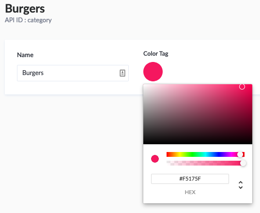
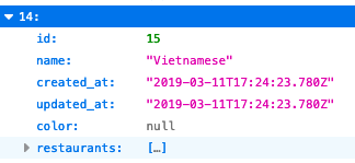
But changing the value doesn't give me the option to save. Checking the API (http://localhost:1337/categories) shows that the color key doesn't appear anywhere...
Back to the Github post: an important line is actually missing.
1"columnType": "longtext"which allows to create a proper color column in the database.
1// ./api/category/models/Category.settings.json
2{
3 //.....
4 "attributes": {
5 "color": {
6 "type": "colorpicker",
7 "columnType": "longtext"
8 },
9 //......
10 }
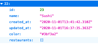
11}Cool, now the color key shows up in the API!
But modifying the color via the picker still doesn't register anything. A link seems to be missing between the color picker's state and the platform.
This is where I started scratching my head a bit more. The docs don't actually give you much info on this but I found a clue in another section
Registering the ColorPicker plugin via the admin/src/index actually exposes a collection of props to the component, including an onChange prop needed to pass its values over to the platform.
Let's complete our component:
1// ./plugins/colorpicker/admin/src/components/colorPicker/index.js
2
3import React, { useState, useEffect } from 'react';
4import { ChromePicker } from 'react-color';
5import styled from 'styled-components';
6
7// STYLES .....
8
9const ColorPicker = (props) => {
10  const [showPicker, setShowPicker] = useState(false);
11  const [color, setColor] = useState(props.value ? props.value : '#FFFFFF');
12
13  /**
14   * Makes the color value available to the document for database update
15   * @param {string} colorValue - in hex format
16   */
17  const updateColorValue = (colorValue) => {
18    props.onChange({ target: { name: 'color', value: colorValue } });
19  };
20
21  /**
22   * Assign a default color value if the document doesn't have one yet
23   */
24  useEffect(() => {
25    if (!props.value) {
26      updateColorValue(color);
27    }
28  }, []);
29
30  /**
31   * Handle color change from the the color picker
32   * @param {string} color - in hex format
33   */
34  const handleChangeComplete = (color) => {
35    setColor(color.hex);
36    updateColorValue(color.hex);
37  };
38
39  return (
40    <div>
41      <Title>Color Tag</Title>
42      <ColorWindow color={color} onClick={() => setShowPicker(true)} />
43      {showPicker ? (
44        <PopOver>
45          <Cover onClick={() => setShowPicker(false)} />
46          <ChromePicker color={color} onChange={handleChangeComplete} />
47        </PopOver>
48      ) : null}
49    </div>
50  );
51};
52
53export default ColorPicker;
54
Here we are! Changes are now recognized, can be saved to the database and are available via the API.
Check out these nice colors on our front-end. Ok, not so nice but you get the point :)

Conclusion
This was an exploration and the component might not be perfect (accessibility...) but it works.
Mission Complete 🎉
Here is the full repo if you are interested. Have fun!